Redesigning a $163B
investor portal during a pandemic.
Freddie Mac's Credit Risk Transfer microsite went from a regulatory information page to the company's primary channel for institutional investors when COVID killed in-person roadshows. I led the redesign that made it competitive in the fixed-income market.
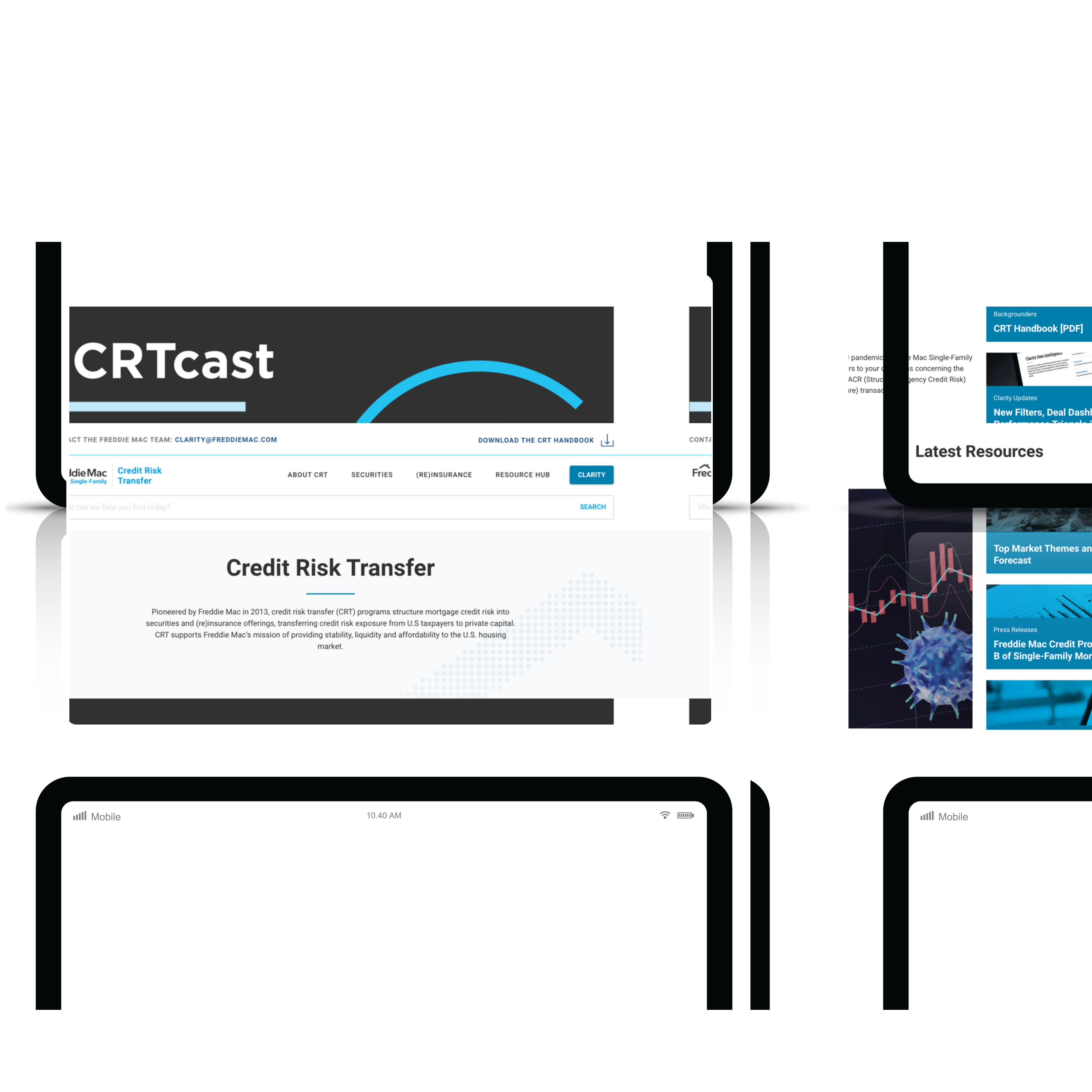
A microsite suddenly carrying institutional weight.
The CRT Microsite launched as a proof of concept to market Freddie Mac's Credit Risk Transfer offerings. Tight deadlines meant several requirements got cut. Then COVID hit.
In-person roadshows and fixed-income conferences stopped overnight. The site that was built as a marketing supplement became the primary channel for institutional investors evaluating billions in CRT deal flow.
A year of behavioral data later, leadership wanted to know: how do we make this site competitive in the fixed-income market?
Built for regulators. Used by investors.
The original site was structured for the general housing market and regulatory audiences. The investor experience was an afterthought.
STACR and ACIS sat buried under an Offerings parent, even though most investors arrived knowing exactly which product they wanted. Bond characteristics were buried deeper still. Information that should have taken a click took four. Sales-critical context was missing entirely.
The site wasn't broken. It just wasn't built for the people who'd ended up using it.
Investors found the site easy to navigate, but in some cases there were too many clicks to access the information they desired.
— Internal Stakeholder InterviewStarting from outside the room.
I joined after the initial launch, so I started by interviewing the Digital Marketing and CRT teams to learn what CRT actually was, what the original team had wanted to ship, and where the gap had opened between intent and reality.
Then I paired those interviews with a year of behavioral analytics from the live site to triangulate what investors were actually doing.
Stakeholder interviews across Digital Marketing, CRT, and Investor Relations
of behavioral data analyzed to identify drop-off points and content gaps
distinct user groups conflated in the original IA: regulators and investors
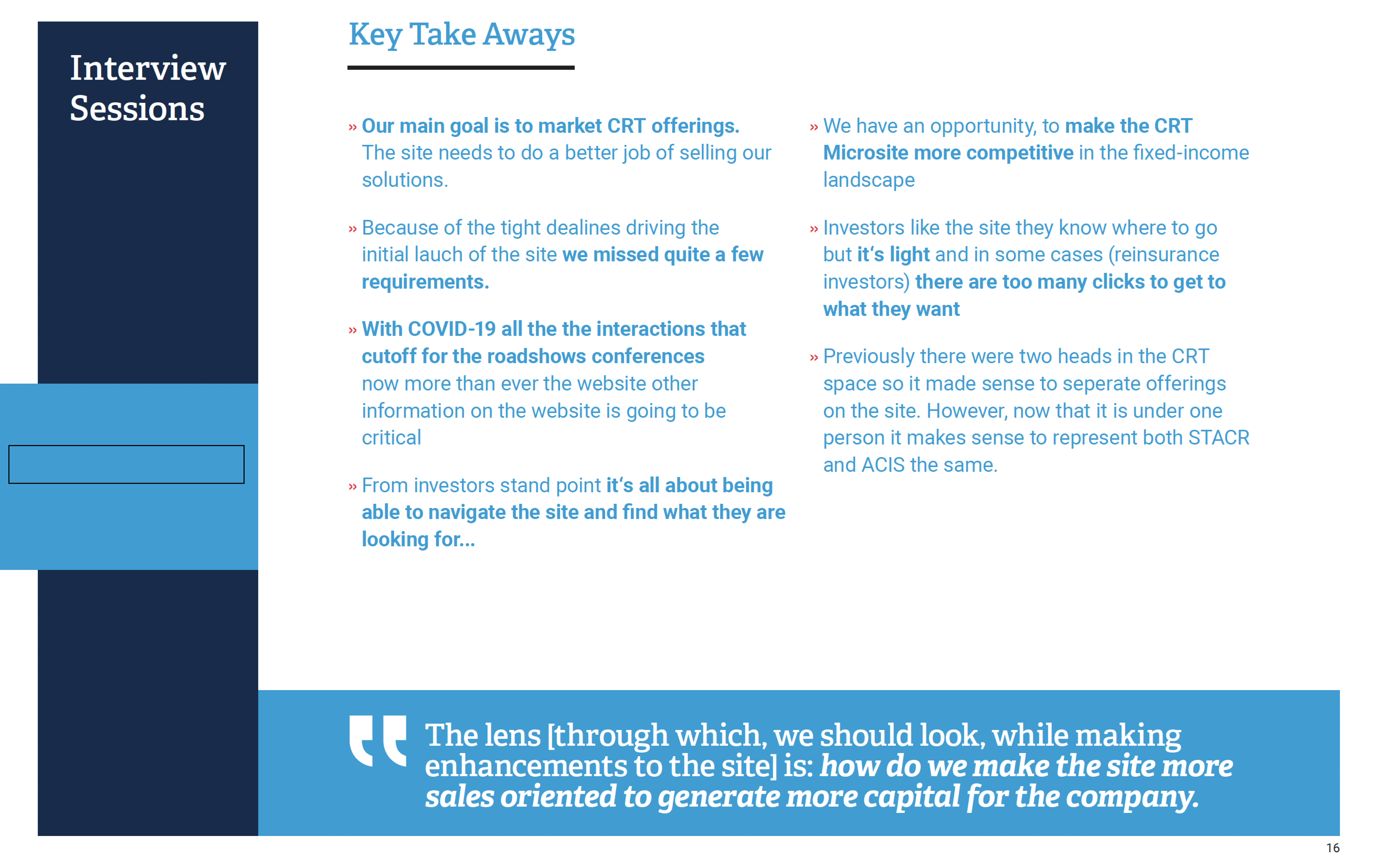
Interview synthesis pulled from the findings deck I presented to leadership.
What success had to look like.
UX was still a relatively new discipline at Freddie Mac. Before designing anything, I ran a workshop with stakeholders to lock down what we were actually optimizing for and how we'd know if it worked.
We left with three goals everyone could repeat from memory.
Sell, don't just inform.
Reframe the site from regulatory disclosure to sales tool. Lead with investor benefits, not internal product structure.
Reduce time to information.
Cut the clicks between an investor landing on the site and finding the bond characteristic, deal sheet, or contact they came for.
Establish a voice.
Innovation, safety, leadership. A consistent point of view across content so the site feels like one product, not five departments.
Five calls that shaped the redesign.
A “content-focused approach” became my framework for the work. Every design decision had to either pull friction out of the path to information or sharpen the voice. If it did neither, it didn't ship.
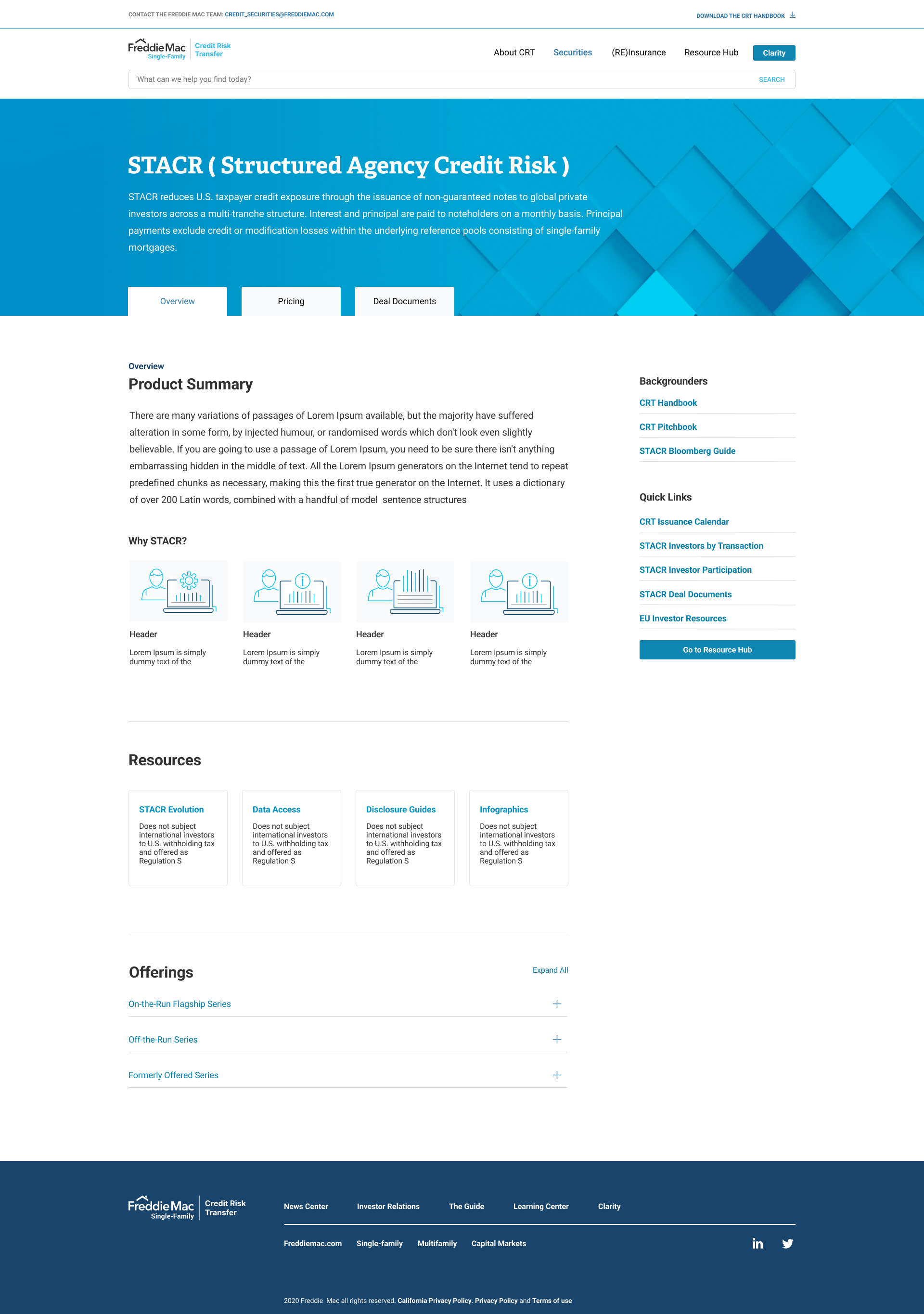
Promoted STACR and ACIS out of Offerings into the top nav.
Investors arrived knowing which product they wanted. The Offerings parent added a hop without adding signal — behavioral data showed drop-off at that intermediate page. Removing it cut a click and made both products discoverable from any page on the site.
Lost a marketing surface where Offerings had been used to frame the broader CRT story. Recovered that real estate on the homepage hero where it could do the same job earlier in the path.
Promoted bond characteristics out of the deep funnel.
The single biggest reason investors didn't return was that they couldn't find the deal-level data they needed quickly. Bond characteristics moved from a buried sub-page to a primary discovery surface.
Less editorial real estate on landing pages. Worth it.
Rebuilt search around investor language, not internal taxonomy.
Investors searched for deal codes, dates, and bond classes. The legacy search returned marketing pages. New search prioritized data-rich pages and used synonyms drawn from interview transcripts.
Required content tagging work the marketing team had to commit to maintaining.
Standardized templates for text-heavy pages.
Page-by-page content drift was the source of most of the friction reported in interviews. Three templates — overview, deal page, news — kept structure consistent and let the marketing team publish faster without designer involvement.
Some flagship pages lost custom layouts. Net win for navigability.
Built a content-first voice guide with the writing team.
"Innovation, safety, leadership" had to mean something on the page. Co-authored writing guidance and audit rubrics so the voice held up after I left.
Slowed the first sprint. Paid for itself by the third.
The IA shift, in one move.
The clearest change wasn't visual. It was structural. Removing the Offerings parent and elevating STACR and ACIS to the top nav matched the IA to how investors actually moved through their evaluation.
STACR and ACIS sat under a single Offerings parent. Investors arrived knowing which product they wanted, but had to click through the parent before they could get there.
Removed the Offerings parent. Both products now live at the top level of the site, reachable in a single click from any page.
What shipped.
Three screens that show how the design decisions land in the live experience.
Homepage with sales-led hero
Replaced the generic regulatory framing with a benefits-led hero block. Voice guidelines applied across editorial copy.
Direct-access product page
STACR and ACIS now sit at the top of the global nav. Investors land on the product they came for without an intermediate hop.
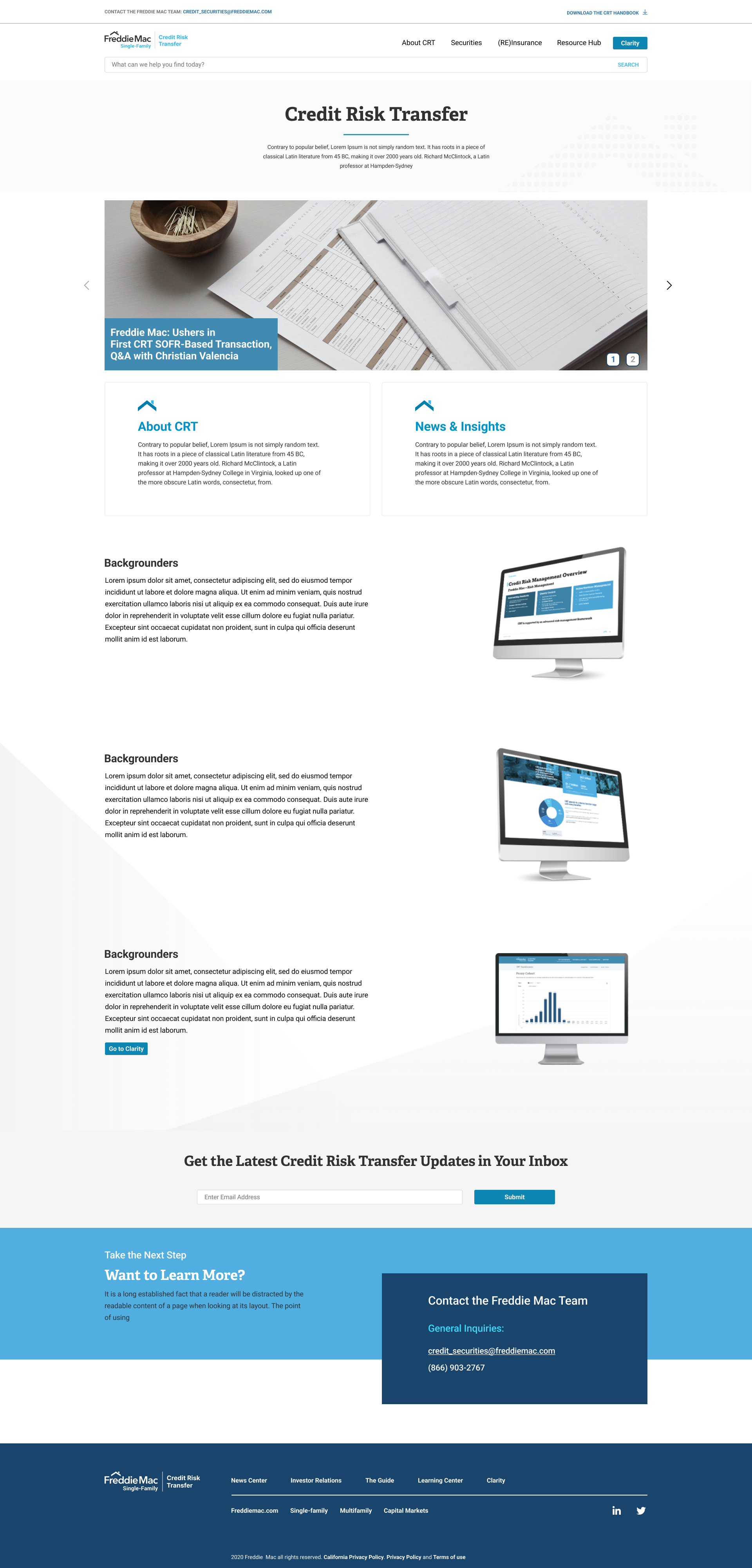
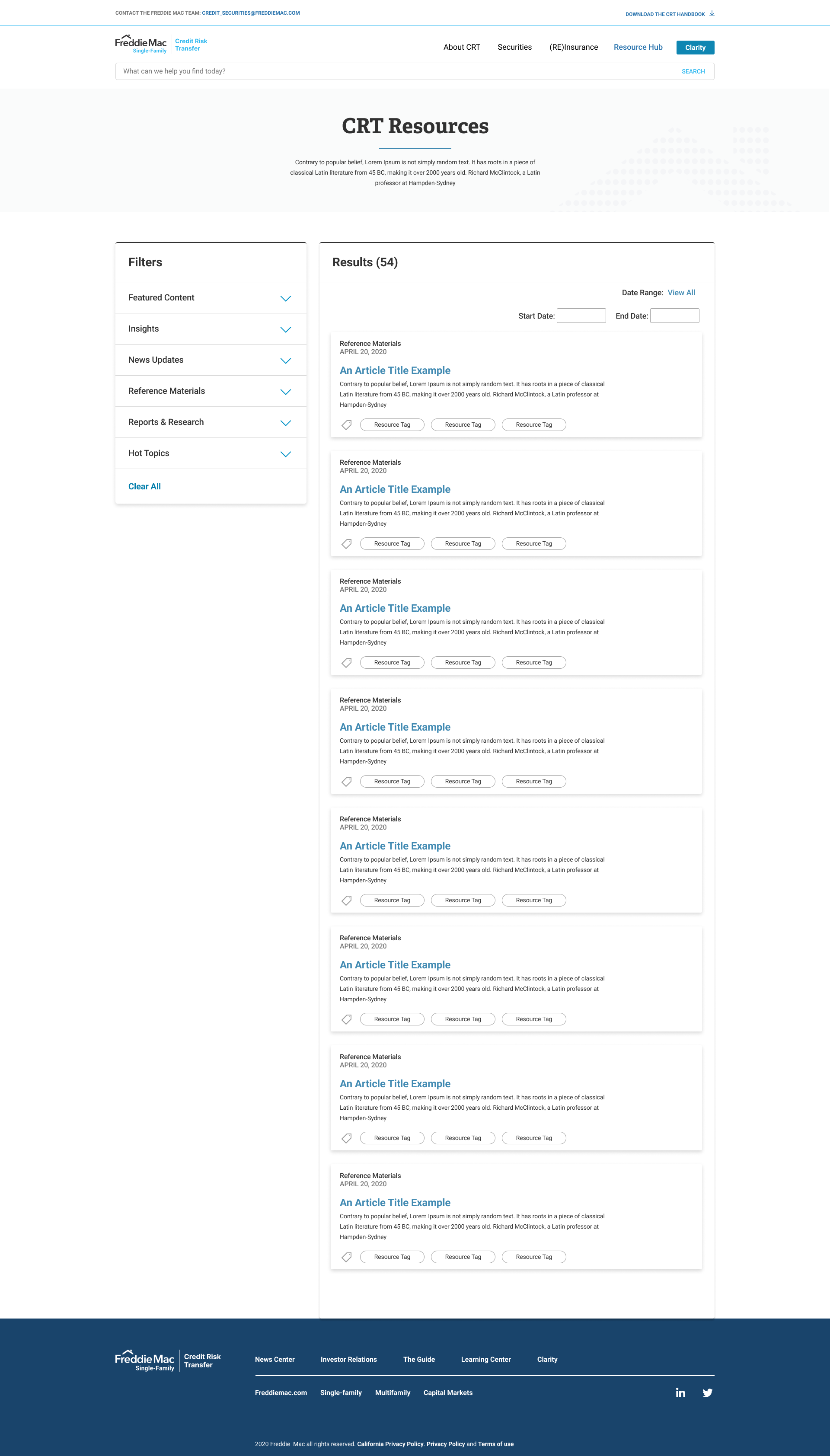
Standardized deal page template
Bond characteristics promoted to a primary surface. Consistent template across deals lets marketing publish without design involvement.
What the work actually moved.
I led the design through implementation handoff. Several pages shipped under my watch; the remainder rolled out by the successor team after my transition. Early data on the pages that did ship pointed in one direction.
Preliminary data showed shorter, more direct paths to deal-level information after rollout.
Removed the intermediate Offerings page. Both products now reachable in a single click from any page on the site.
Reusable page templates handed to the marketing team, removing design as a publishing bottleneck.
What I'd do differently.
Hindsight on a project I cared about.