The
Pulse.
A visual identity for FanDuel's live-betting feature, built in two weeks. Live bets lifted +14% after launch.

Branding without a brand.
I wasn't on the FanDuel team when this started. By the time I was briefed in, the live-betting team had a name — The Pulse — and a handful of brand assets. What they didn't have was a system to make those assets work together.
Logos, color combos, motion-friendly elements. All of it had to live inside a card system already locked to fixed dimensions, sit alongside straight bets and parlays up to four legs long, and feel as electric as live betting itself.
Two weeks to make it cohesive.
Inputs
- A refreshed Pulse logo identity
- Updated color palette
- Modern background patterns
- Card dimensions (300×144 / 340×144)
- Light + dark mode requirements
Gaps
- A unifying brand identity
- A typographic system for cards
- Voice or tone direction
- Rules for max-depth (3–4 legs)
- Cross-platform card consistency
Four words. One feeling.
Before designing anything, I had to define what The Pulse should feel like. I distilled the brief, the context, and the energy of live betting itself into four guiding themes. Every visual decision after that had to defend itself against these four words.
Functional.
Live betting moves fast. The card had to be readable in a glance — odds, legs, action — without the user thinking about the interface itself.
Adrenaline.
The visual language had to carry the same energy as the moment a bet lands. Saturated color, sharp contrast, and motion-friendly composition.
Edgy & Fast.
Type at odd weights, decisive negative space, hard edges. Nothing soft. Nothing apologetic. The Pulse had to feel like it knew where it was going.
Unique.
Different enough from the rest of the FanDuel surface to feel like a feature, not a footnote — but consistent enough to belong.
Designing inside the box.
The card dimensions were already locked. The cards had to fit inside an existing platform pattern, which meant the brand work had to happen inside 300 × 144 pixels.
Three structural decisions made the system work.
300 × 144 for standard cards, 340 × 144 for variants. Locking the height enforced consistency across the live feed and made cards predictable inside any container.
Display caps at 3–4 legs. Beyond that, the card couldn't keep readability without either shrinking type below accessible sizes or breaking the height constraint.
Every visual element had to read in both modes. Background patterns, type weight, and accent contrast all got tuned twice — once for each mode — so the brand identity stayed intact regardless of system theme.
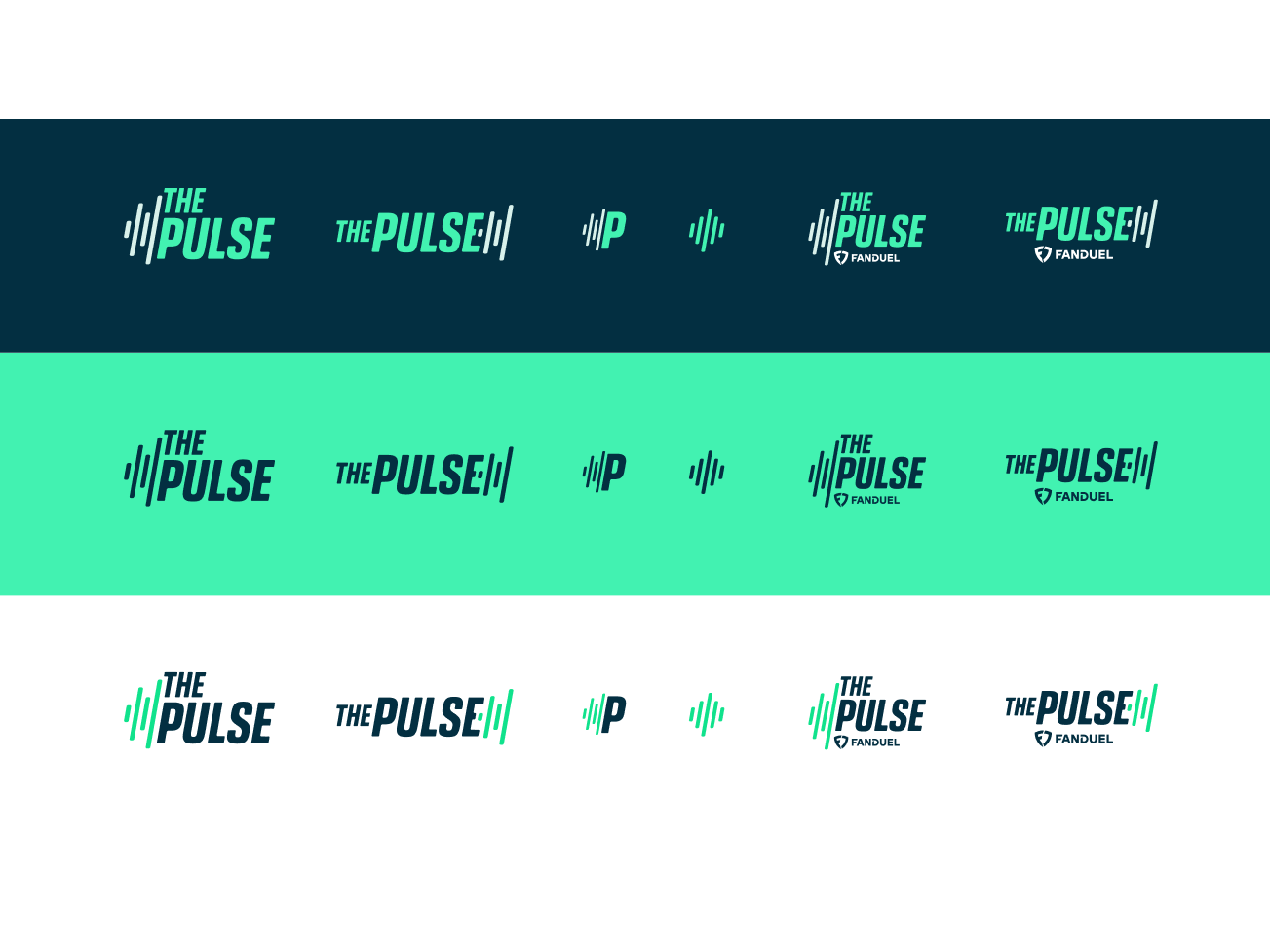
— Branding exploration: type sizes, color combinations, and theme keywords —
The result, live.
A card that earns its place in a fast-moving live feed. Type, color, motion, and pattern working together inside the dimensions that were already there.

In the wild.
Card system extended into the live feed, parlay flows, and bet narratives. Same rules across every surface, dark mode and light.


Live bets, lifted.
After launch, live bets increased 14%. The card system shipped to every surface where The Pulse appears, and the brand identity scaled into parlays, narratives, and promotional contexts without needing to be redrawn.
Two-week takeaways.
What a sprint this fast taught me — and what I'd carry into the next one.